Analytics
The Analytics tab provides a summary of your virtual being's performance – conversations, users, messages, and duration – with period-over-period comparison.
The Analytics tab gives you a high-level view of how your virtual being is performing. It shows aggregate metrics across your deployment with time-range selection, profile or workspace breakdown, and a visual comparison against the previous period.
Summary Metrics
The top of the Analytics page displays four key metrics:
| Metric | What It Measures |
|---|---|
| Conversations | Total number of conversation sessions in the selected period |
| End users | Number of unique users who had a conversation |
| Text messages | Total number of messages exchanged (both user and virtual being messages) |
| Total duration | Combined duration of all conversation sessions |
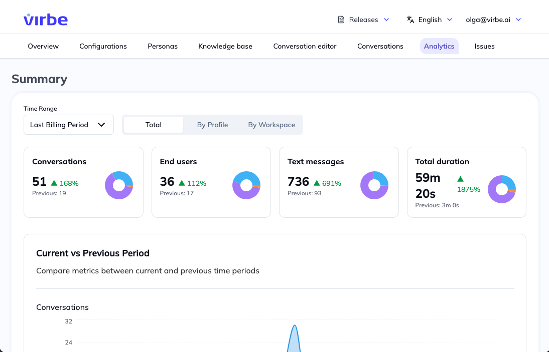
Each metric shows the current period value alongside a percentage change compared to the previous equivalent period. A positive change (green) indicates growth; a negative change (red) indicates a decline.
Example: If the selected time range is "Last Billing Period" and your virtual being had 51 conversations this period vs. 36 last period, Conversations shows 51 +109%.
Time Range
Use the Time Range selector to choose the period for analysis:
- Last Billing Period – The most recent complete billing cycle
- Custom date ranges (depending on your plan)
The comparison metrics always compare the selected period against the equivalent preceding period of the same length.
View By
The View by control lets you break down metrics in different ways:
| Option | Description |
|---|---|
| Total | Aggregate across all profiles and workspaces |
| By Profile | Separate metrics for each deployment profile (Web Widget, Kiosk, etc.) |
| By Workspace | Breakdown by workspace (relevant for multi-workspace plans) |
Use By Profile to understand which touchpoints are most active, or to compare the performance of a newly deployed kiosk against an established web widget.
Current vs. Previous Period Chart
Below the summary metrics, a line chart compares the current period against the previous period day-by-day (or week-by-week, depending on the time range). This visualization helps identify:
- Growth trends
- Seasonal patterns
- Days with unusually high or low activity
- The impact of marketing campaigns or events
Interpreting the Metrics
Conversations vs. End Users: A high Conversations-to-End Users ratio means users are returning for multiple sessions – a sign of an engaging virtual being. A ratio close to 1:1 means most users only chat once.
Text Messages per Conversation: Divide total text messages by conversations to get the average message depth. Higher values generally indicate more engaged, longer conversations.
Total Duration: High total duration alongside high message counts suggests users are having substantive conversations. Very low average duration per conversation may indicate users are not getting satisfying responses.
Using Analytics for Optimization
- Monitor the Conversations trend after a pipeline update to see if engagement improves
- Check End users after a new deployment to measure reach
- If Text messages is low, investigate whether your virtual being is answering questions fully or whether users are giving up early
- Use By Profile breakdown to compare kiosk and web widget performance separately, and optimize each deployment independently