Metahuman Kiosk Profile Settings
Configure behavior, focus state, camera angle, hardware signals, and security for a Metahuman Kiosk profile.
The Settings tab of a Metahuman Kiosk profile controls how the kiosk behaves in a physical installation – including how it detects and responds to approaching users, how long it waits before returning to idle, what the avatar looks like on screen, and how hardware devices like scanners are integrated.
Configuration Load
| Option | Description |
|---|---|
| Auto connect on configuration load | When enabled, the kiosk application automatically connects to the Virbe backend when the app starts. Recommended for always-on public installations to ensure the virtual being is immediately ready when a user approaches. |
Conversation Signals Settings
Same signal types as the web widget, tuned for kiosk use:
| Signal | Description |
|---|---|
| Start signal | Fires when a new conversation session starts (typically when a user is detected) |
| Interrupt signal | Fires when the user manually interrupts a response |
| Stop signal | Fires when the conversation ends (user walks away, defocus timeout) |
These signals are consumed by the On conversation-start and On conversation-stop Handlers in the Conversation Editor.
Custom Signals (Hardware Integration)
Beyond the built-in signals, you can define custom signal names for hardware events from connected devices (RFID readers, barcode scanners, QR code scanners, badge readers):
| Field | Description |
|---|---|
| Signal name | The name of the signal that the kiosk app sends when the scanner reads a value (e.g., scan, badge-scan, rfid-read) |
The scanned value is passed as the signal's payload. In the Conversation Editor, use a Route by Signal node to react to this signal and branch accordingly. The signal name must exactly match what is configured here.
This is the foundation for use cases like product lookup by barcode scan or visitor registration via badge scan.
Focus State Behaviour
Controls what happens when a user approaches the kiosk (focus is detected – typically via camera or motion sensor):
| Option | Description |
|---|---|
| Create new end user on focus | Generates a new end user record each time someone approaches. Useful for anonymous, sequential public interactions. |
| Create new conversation on focus | Starts a fresh conversation session each time focus is detected, regardless of any prior conversation state. |
| Defocus after [X] seconds | How long (in seconds) the kiosk waits with no detected user before returning to the idle/defocus state. |
Listening State Behaviour
| Option | Description |
|---|---|
| Stop listening after [X] seconds | Stops voice input capture after X seconds of user silence. Prevents the microphone from staying open indefinitely when the user stops speaking. |
Defocus State Behaviour
Controls what happens when the user walks away (defocus state is entered):
| Option | Description |
|---|---|
| Persist end user information | Retains the end user record after defocus, so if the same user returns, their data is preserved |
| Persist conversation state | Keeps the conversation history after defocus |
| Disconnect conversation | Fully resets the conversation when the user leaves – the next user starts fresh |
For most public installations, disconnecting conversation on defocus is recommended to ensure privacy between users.
Localization
Set the kiosk interface language (affects UI text labels and date/time formatting), independently of the conversation language.
UI Customization
Customize the styling of the kiosk's interface.
| Option | Description |
|---|---|
| Tap to start | Label text for the button shown on the kiosk's idle screen inviting a user to begin (default: "Tap to start") |
| Tap to Start button alignment (X, Y) | Position the "Tap to start" button on screen using normalized X and Y coordinates from 0 to 1, where 0.5 / 0.5 centers it |
| Quick reply buttons text color | Set the text color for quick reply buttons to match your branding |
| Remove Virbe logo | Hide the Virbe watermark from the kiosk UI |
| Custom logo | Provide a URL to a custom logo to display on the kiosk |
Camera Angle
Sets how the Metahuman avatar is framed on screen:
| Option | Description |
|---|---|
| Face | Close-up head and shoulders – creates an intimate, personal interaction feel |
| Upper body | Waist-up view – professional and balanced for most use cases |
| Full body | Full-height avatar – immersive and impactful for large screens or branded installations |
Scene Customization
| Option | Description |
|---|---|
| Background color | Background color of the 3D scene behind the avatar |
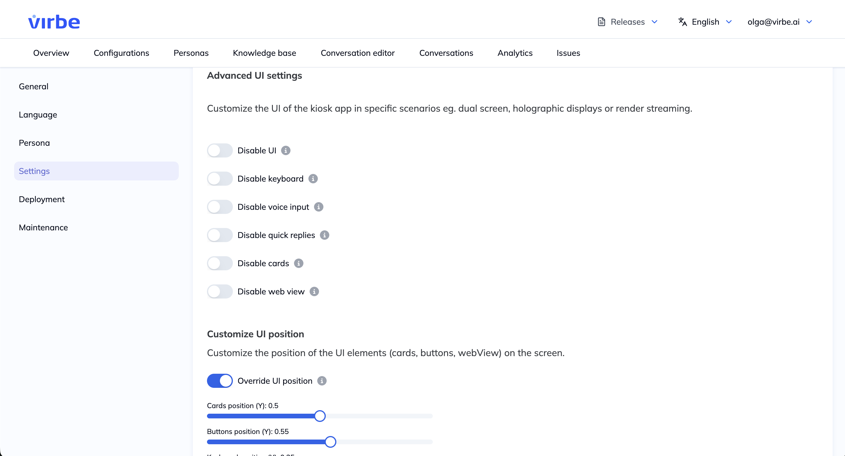
Advanced UI Settings
Customize the UI of the kiosk app in specific scenarios eg. dual screen, holographic displays or render streaming.
| Option | Description |
|---|---|
| Disable UI | Hides the app UI completely – useful for custom display setups, holographic installations, or scenarios where a separate UI is used |
| Disable keyboard | Prevents the on-screen keyboard from appearing – for voice-only interactions |
| Disable voice input | Disables the microphone – for text-only kiosk interactions (e.g., touchscreen input only) |
| Disable quick replies | Hides quick reply buttons from the kiosk UI |
| Disable cards | Hides card-type responses from the kiosk UI |
| Disable web view | Hides the embedded web view component from the kiosk UI |
Customize UI position
Customize the position of the UI elements (cards, buttons, webView) on the screen.
| Option | Description |
|---|---|
| Override UI position | Enables custom positioning for the UI elements below, instead of the default layout |
| Cards position (Y) | Vertical position of card responses on screen, normalized from 0 to 1 |
| Buttons position (Y) | Vertical position of quick reply buttons on screen, normalized from 0 to 1 |
| Keyboard position (Y) | Vertical position of the on-screen keyboard, normalized from 0 to 1 |
| Speak button position (Y) | Vertical position of the voice input (speak) button, normalized from 0 to 1 |
| Quick reply height | Height of quick reply buttons, in pixels |
| Card height | Height of card responses, in pixels |
| Card Modal Offsets | Left, top, right, and bottom offsets fine-tuning the position of the card modal on screen |
| Web View offsets | Left, top, right, and bottom offsets fine-tuning the position of the embedded web view |
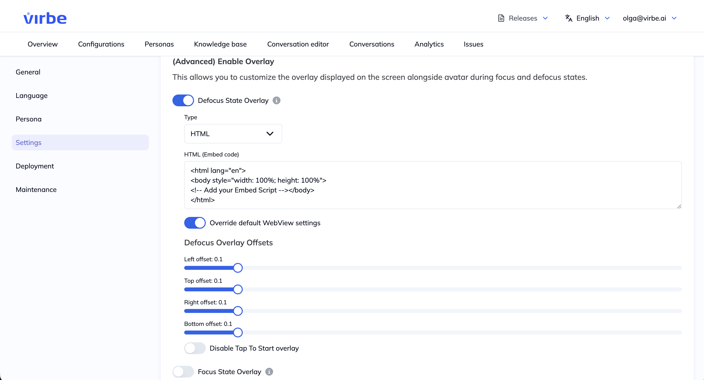
Enable overlay
This allows you to customize the overlay displayed on the screen alongside the avatar during focus and defocus states.
| Option | Description |
|---|---|
| Defocus State Overlay | Enables a custom overlay shown while the kiosk is in the defocus (idle) state |
| Focus State Overlay | Enables a custom overlay shown while the kiosk is in the focus (active) state |
| Type | Overlay content type for the selected state – HTML (custom embed code) or URL (external page) |
| HTML (Embed code) | Custom HTML embed code rendered in the overlay, when Type is set to HTML |
| Url | External URL displayed in the overlay, when Type is set to URL |
| Override default WebView settings | Enables custom positioning for the overlay, instead of using the default WebView's positioning |
| Overlay Offsets | Left, top, right, and bottom offsets fine-tuning the position of the focus/defocus overlay on screen |
| Disable Tap To Start overlay | Hides the "Tap to start" prompt from the defocus overlay |
Security Settings
| Option | Description |
|---|---|
| Security PIN | Set an optional PIN code required to access kiosk settings from within the app. Recommended for public installations to prevent unauthorized configuration changes. |