Quick Reply
Tappable reply buttons – tapping one sends its label as the user's message and clears the button set.
The Quick Reply node presents the user with a set of labelled buttons. Tapping a button sends its label as the user's message and dismisses the button set – the conversation continues as if the user had typed that text.
Quick Replies are a powerful way to guide users toward expected inputs without forcing them to type, reducing input errors and making conversations feel faster and more natural.
Available in: Conversational Flows
Configuration
| Field | Description |
|---|---|
| Buttons | One or more button labels. Each label is what gets sent as the user's message when tapped. |
| Prompt text | Optional text shown above the buttons, framing the choice (e.g. "How can I help you today?"). |
Add buttons with + Add button. There is a limit of 5 buttons to keep the set focused – too many options defeats the purpose. Three to five buttons is a practical maximum for most use cases.
Routing is built in
Quick Reply doesn't need a separate router node afterward. Each button gets its own output port directly on the node – connect each one to whatever should happen when that button is tapped. There's also a Not matched port, used when the user's reply doesn't match any button (e.g. they typed a free-text message instead of tapping one):
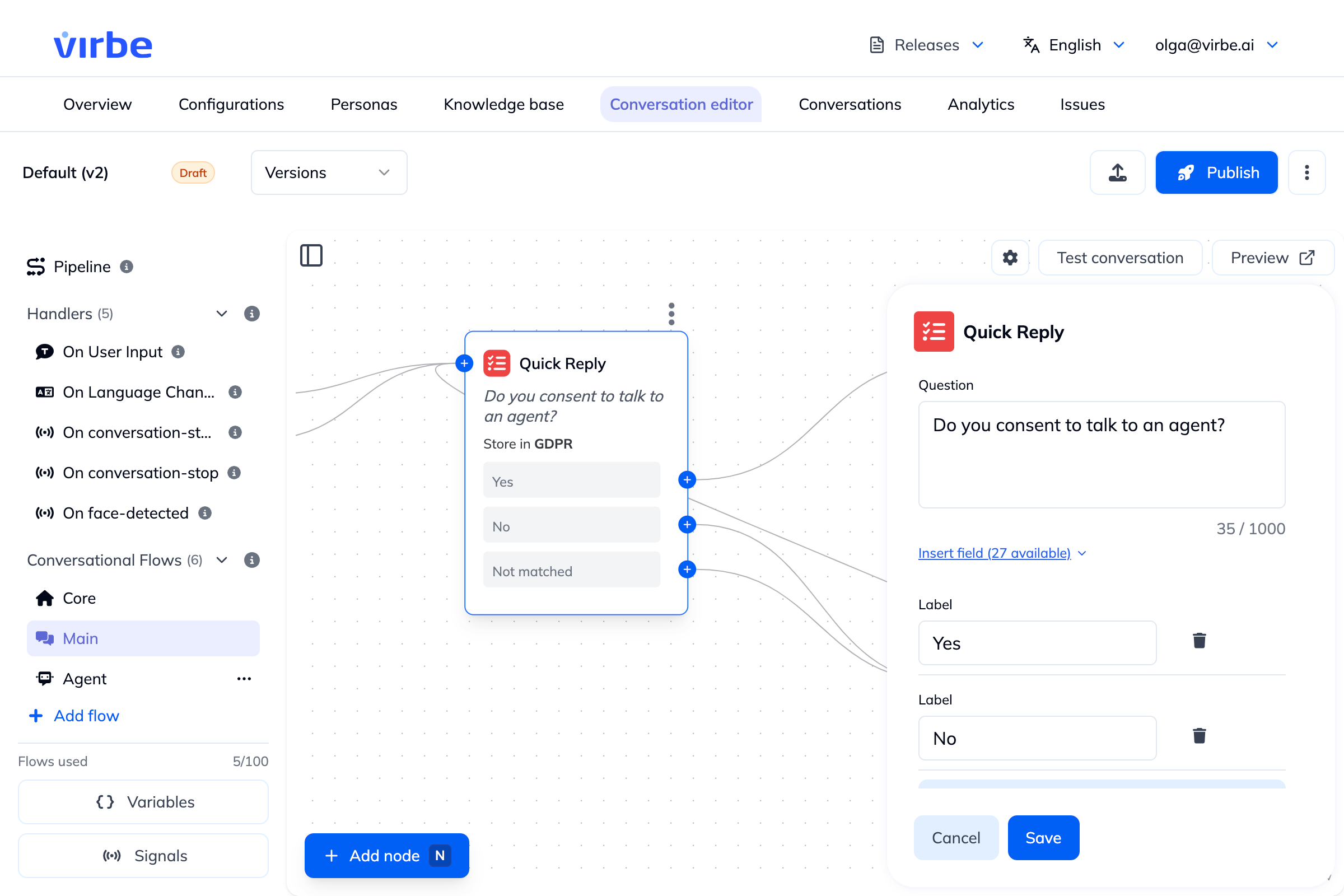
[Quick Reply: "Track my order" | "Return a product" | "Talk to a human"]
    ├── "Track my order"   ──► Order Tracking flow
    ├── "Return a product" ──► Returns flow
    ├── "Talk to a human"  ──► Go to Flow: Human Handover
    └── Not matched        ──► [fallback response]
Quick Replies vs UI Cards
| Quick Reply | UI Cards | |
|---|---|---|
| Appearance | Text buttons | Rich cards with images and details |
| User action | Sends button label as message, routed via its own output port | Same – each card routes via its own output port |
| Best for | Simple branching choices | Showcasing products, options, or content |
Use Quick Replies when the choice itself is all the user needs to see. Use UI Cards when each option benefits from an image, description, or secondary action.